Scaling Design Systems
“Stellar”
Design System
Design System Documentation
Background
In the Spring of 2023, I completed an interactive Design Systems certification taught by one of the industry’s leading experts, Dan Mall. By the end of the course, I created a design system to power 3 websites under 1 compony brand. The following is a case study outlining my process from beginning to end.
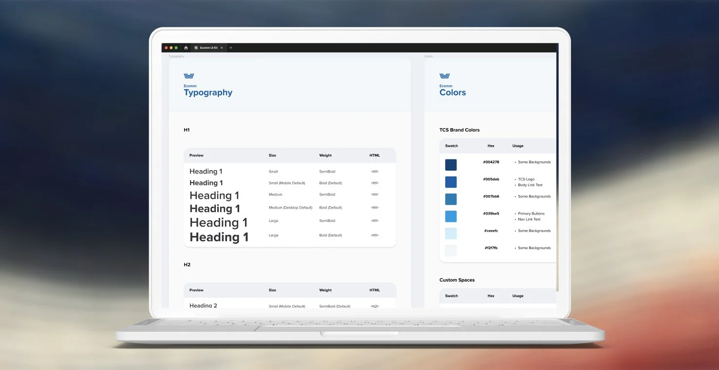
If you’re interested in seeing how I applied my expertise in Design Systems beyond this certification course, see Building An E-commerce Design System.
Project Brief
The Product
IPTS (The Interplanetary Travel Syndicate) provides travel solutions to different places around the universe.
The 3 websites are:
IPTS.org: An informational website where you can find the latest news and happenings with the IPTS.
IPTS Travel: A website where you can browse and book travel to and from multiple destinations.
IPTS Rail: A real-time updated web app where you can view lines, routes, and times for all commuter lines.
Getting Started
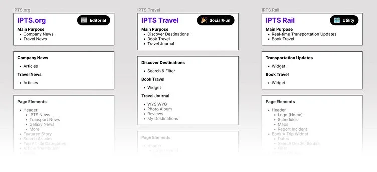
I felt it was important to first establish what each website should do by outlining their main purposes, main content, and any page elements that would support the content.
Research
After establishing a general idea of each site's purpose and content, I gathered screenshots from different websites that serve similar purposes and provide similar content. While auditing those sites, I recognized similar patterns, so I assembled a collage of screenshots for each pattern from these sites and noted what would and would not work for my products.
Design
Wireframes
To visualize the hierarchy of each page, I created wireframes. The wireframes informed the following:
The general layout of each page
The page sections that made up each layout
The components that made up each section.
Styles
Inspired by the style in the Disney+ series “Loki”, I decided on a retro theme for the 3 websites. I put together a palette of colors, typography styles and spacing rules to begin with, which would slightly change later as I designed for high-fidelity.
By making style decisions before designing, I didn’t have to make those decisions later, keeping everything quick and consistent. The best part is, the styles are saved in one place and cascade to all elements that reference those styles within the design, making it fast and easy to switch out a color or style if I decided to adjust the theming later.
Process
I designed all sites at the same time with each page next to each other. This made it easy to:
Move/copy components from one site to another
Quickly see how changes to a component or style effects all sites
I would also update components while zoomed out to see how the updates affected each page simultaneously.
Information Widgets
The key purpose for each site is to provide information. I noticed similar solutions in my research for retrieving information, which led me to create a widget for each site that displays info or provides a way to search for info. These widgets share a common visual style and are positioned as the main focal point at the top of each site's homepage.
The widgets are built with shared components, which grounds each site with a common visual and functional language and makes each site look like they belong to the same collection of resources.
IPTS Final Results
Site Designs
Component Library
IPTS Component Library (Figma)
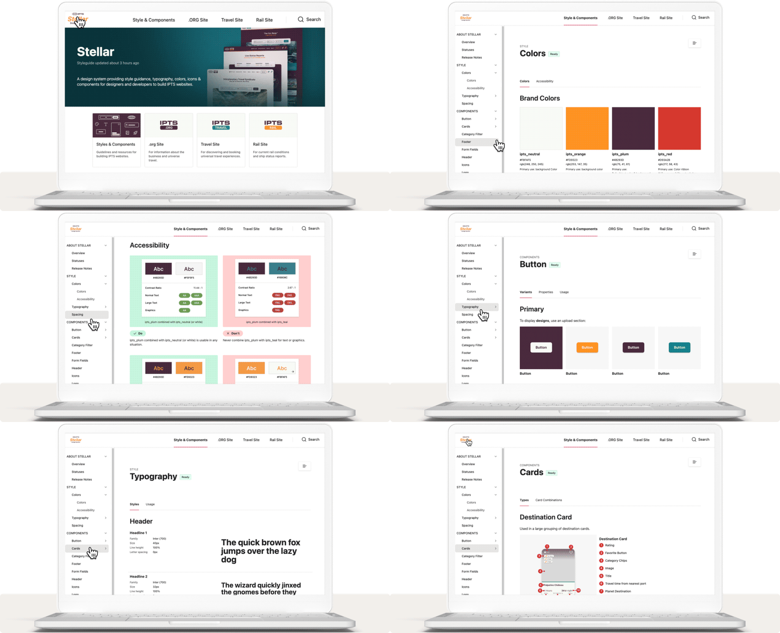
Style Guide Documentation
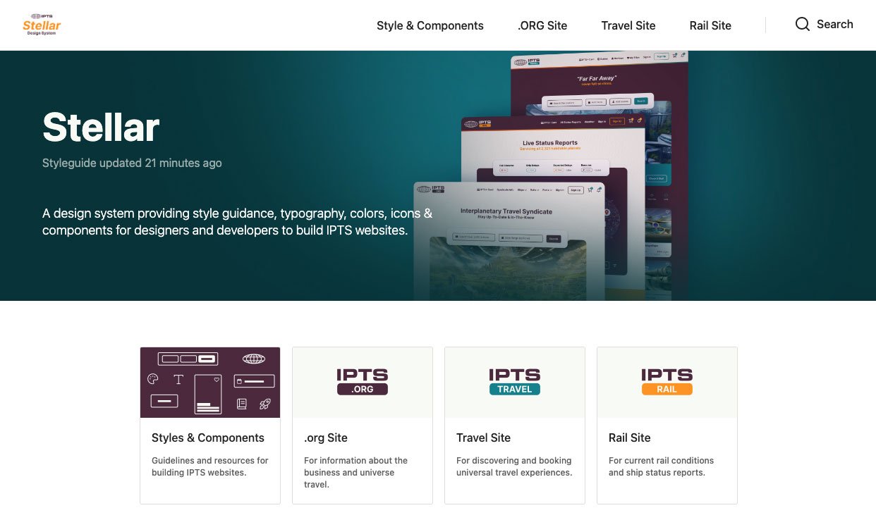
Check out the completed documentation on Zeroheight.
Successful Rebrand
IPTS —> Shuddle
After finishing the IPTS Design System, it was time for a rebrand with a new set of colors, logos and type treatments. Also, the company name changed from IPTS to Shuddle.
Fortunately, it was easy to quickly switch everything out because everything was saved as a style or component. Within about 10 minutes, I created a new Shuddle component library by duplicating the IPTS library and swapping out the old styles and logos for new ones. Then, I swapped the IPTS library in all of the IPTS page designs for the new Shuddle library.
Thanks to the dynamic nature of how the UI Kit was created and implemented, all of my styles and components instantly changed in the design file for a successful rebrand. I was even able to sync the Zeroheight to quickly update the documentation with the new styles.
Create a Design System to power 3 websites under 1 company brand called IPTS. The Design System should include the following:
3 Website Designs (Logo provided)
Foundational UI Components and Styles (Figma)
Style Guideline documentation for the UI Components and Styles
Shuddle Final Results
Site Designs
Component Library
Shuddle Component Library (Figma)


