The Container Store
Product Display Page (PDP) Enhancements
Objective
Facilitate informed purchasing decisions by ensuring key product details are easily discoverable and understandable on both desktop and mobile platforms
Elevate the design to meet brand standards
Improve the overall user experience


Discover The Problem
Stakeholder Interviews
A few weeks before I began this project, upper management put our User Testing subscription on hold until more funds could be allocated toward the UX budget. I resorted to stakeholder interviews instead to get their perspective on providing value for both the user and business. The following is a consolidated view of the key insights gained from these discussions.
Note: Most insights pertain to desktop and mobile experiences. The examples below are not exclusive to the device represented.
What are common complaints you have received about the PDP page?
What is most noticeable to you in terms of the overall page design?
What experience improvements do you feel might help the business?
My Observations
The following is an example of my process for documenting pain-points and potential opportunities for improving value for the user and business. I followed this process for each PDP template and used it to help group insights and facilitate Stakeholder discussions.
Competitive Analysis
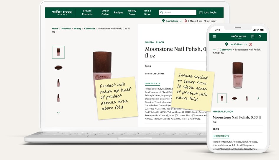
Before executing any design ideation, I began researching the desktop and mobile experiences of 22 other retail websites. I annotated each experience, which I later organized into insight groups.



Define The Problem
Insight Groupings
After completing my research, I grouped like insights together to narrow in on the main problem areas.
New Problem Statement
It is difficult to quickly find and understand key information on all product pages due to a lack of content organization, visual hierarchy, and basic design principals. This could reduce add-to-cart rate and increase bounce rate, resulting in decreased sales and reduced loyalty.
Develop The Solution
Confusing Dimensions
Challenge
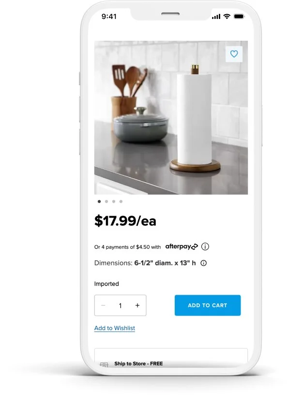
The dimensions are a key aspect of our user’s shopping experience, but they were difficult to locate among other product details and they visually lacked separation from each other, making them difficult to understand.
BeforeChallenge
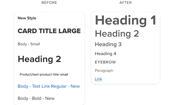
Arbitrary text styles, iconography, and spacing created a lack of visual hierarchy and consistency, further complicating the user's ability to process information.
AfterSuboptimal Element Sizing
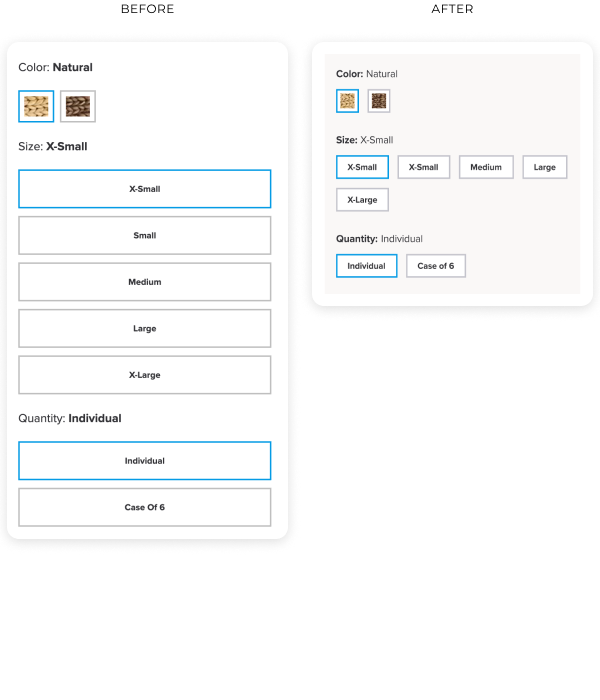
Challenge
Certain elements were either too large or too small, detracting from the overall usability and aesthetic of the page.
Solution
Use iconography and labels to highlight, inform and visually separate each dimension.
Solution
Adjust scale and styling to optimize space and highlight key information while maintaining accessibility.
Inconsistent Design Elements
Challenge
Key product information was not adequately distinguished from other content, leading to a blend of information that was hard to navigate.
Solution
Consolidate styles into a unified and consistent look and feel. These new styles were also tested against other pages again incorporated into the Design System.
Lack of Visual Separation
Solution
Reposition and highlight key information in a dedicated section, while consolidating and scaling down less important information.
Final Designs
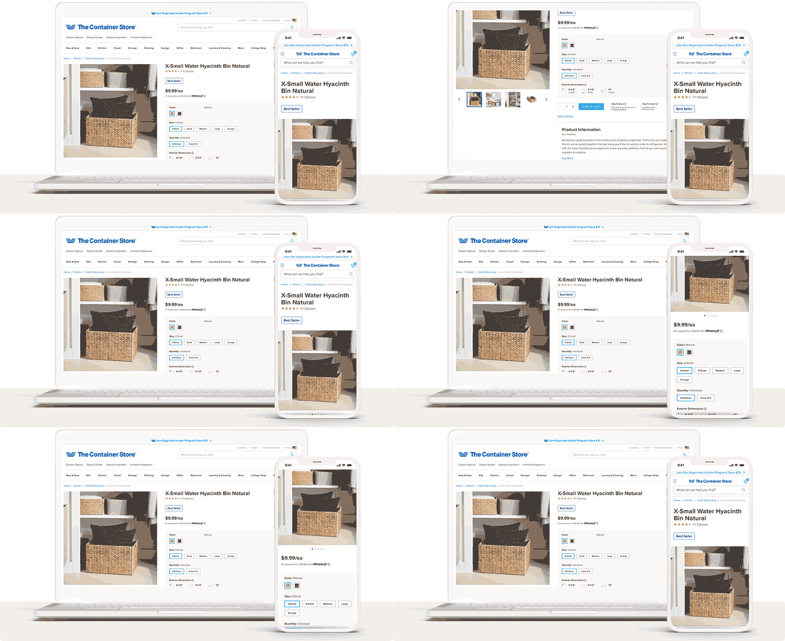
PDP - Default Layout - Live Page
PDP - Multi-Variant Layout - Live Page
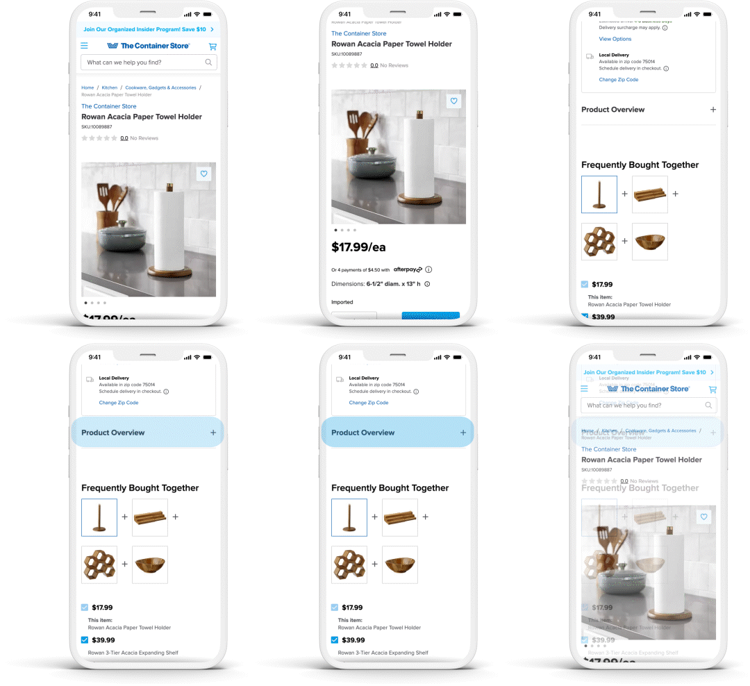
PDP - Kit Layout - Live Page
Deliver The Solution
Integration with Design System
Challenge
As the The Container Store’s Design System was still in its early stages, integrating new styles and ensuring consistency across the entire e-commerce platform posed a significant challenge.
Solution
Design for the PDP
Test in a wide range of contexts across the e-commerce platform
Iterate until cohesion is met in most scenarios
Add to the Design System so that consistency and efficiency are achieved in future designs.
Post-Launch Success


Assumptions
The enhancements likely helped users find key information faster, which convinced them of the product's value before they gave up and left the page, resulting in a higher add-to-cart rate and a lower bounce rate.
Future Plans
Performance Optimization
Further optimizing page load times and responsiveness to ensure a seamless browsing experience across all devices.
Content Enrichment
Enhancing product descriptions and imagery to provide more comprehensive and engaging information to customers.
Comparison Charts
When applicable, allow users to compare features and specs of like-products to help them make more of an informed decision.
User Generated Content
Supplement the page with inspiration from other customers to validate the value of the product and show how it can be used in different ways.
Design System Expansion
Continuing to develop and refine The Container Store's Design System to ensure consistency and efficiency in future design and development efforts.
Conclusion
The enhancements to The Container Store's Product Display Pages have improved the online shopping experience by addressing issues like information overload and inconsistent design elements. The improvements are reflected in key metrics, such as increased add-to-cart rates and reduced bounce rates. This project highlights the value of a robust design system in achieving consistency and efficiency across an e-commerce platform, setting the stage for further enhancements across the website.

